SketchUp IMHO: “SketchUp…No Really…”

In one of my earliest posts in this blog, I mentioned that my first impression of SketchUp was that it looked too simple to be a really effective design tool.  In all honesty – I think a big part of that impression was the fact that I knew it was a pretty inexpensive program compared to other CADD programs I was used to using.  That is commonly known as “perception of value”.  Unfortunately, as consumers, we are generally conditioned to believe that the more expensive something is the better quality it is.  In this case – that perception could not be more wrong!

I have been using SketchUp as my main CADD program for over eight years now and whenever people see my designs and renderings, they often ask what program I used to create them.  I find myself convincing people that it was SketchUp that I used to get those results.  “No, really” is what I often say to other designers in the business (again- because they are used to using more expensive programs).

So, to illustrate my point – I will tell you a quick story.  A former student of mine in undergrad, went on to grad school, and during the four months between grad and undergrad, she worked for me at my company.  During that time, with me, she designed the sets for four commercials, some Christmas decor for two different malls, and a couple of other projects.  I insisted she learn SketchUp for the most efficient collaboration process with me, for the designs.

During the three years she was in grad school, they made her use Vectorworks and Autocad on her designs and sort of “poo-pooed” SketchUp when she would bring it up.  After she graduated, she came back to work for me for another year, where she dove back into using SketchUp as her primary design tool (at my insistence of course).  After a year, she was hired to work on a major television show in the art department.  After a short while there, she started to show them what she could do with SketchUp (they didn’t use the program) and soon she was creating all sorts of models and renderings for the show.  Her work on the show (all in SketchUp) was even featured in the United Scenic Artists union magazine.

Because of her work there, less than a year later, she went on to work as an art director with the same production designer for two seasons of a major cable TV drama series.

I have worked with several very well known film art directors who have requested me to assist with the design work on projects, specifically because I am fast and very good at creating designs in SketchUp.

So, the moral of the story is to not judge anything solely on first impressions and certainly not on cost.  Once I started using the program, SketchUp quickly became my favorite and eventually only real design tool.

Take my word for it.  If you are at all hesitant – give it a try.

If you want to see some of my work – follow this link.

SketchUp IMHO: Textures, Textures Everywhere and Not a One to Use…

If you have been following my blog here on SketchUp (if so – thank you!) you will be aware of two things.  First – you will of course notice that it has been quite some time since I have posted something (more on that later), and second – I really, really like SketchUp.

Except for one thing…

The textures that come with the program.

Since this blog is a part of the two sites we currently manage, one for research images and one for textures, you may think that my criticism is a thinly-veiled comment that is really only self-serving.  While it is true that there is an obvious connection from this post to what we do – trust me – my issue with textures in SketchUp goes back years.  Long before our texture site was even a twinkle in my internet camera’s eye.

Don’t get me wrong – I think it is great that they provide a set of textures to get you started on modeling.  Actually, not many modeling programs provide textures with the program at all, so the fact that they do is a generous addition.  Adding textures to a model helps tremendously in the presentation of your work, and if you plan on rendering your model – then REALISTIC textures are a MUST!   Most of us who do modeling in SketchUp just go out and scour the internet for good textures, but wouldn’t it be more convenient to just be able to grab textures within the program, instead of having to go out and find them…?

The lack of a good selection of nice, high quality textures (in my humble opinion) is the one thing that is holding the program back even just slightly.

Hmmmm… wait a minute… I wonder if they would be interested in working out a deal…?  We could provide them a set of say, 500 hi-resolution architectural textures for free, in exchange for a little mention somewhere on their site… What do you think…?

I think I may have hit on something…

(Okay – admittedly – that last part was a not-so-thinly-veiled plug for our site.  I do, however, still strongly believe that the program would be better with a nice selection of good textures!)

SketchUp IMHO: Piranesi Part 2

Last week I talked about the program Piranesi and gave a broad overview of how it works. This week I want to show a few examples so you can see what the difference is in how they look.

Just to recap – the main purpose of Piranesi is to give a design a more “sketchy” feel to it and that effect can help you when you are communicating your design.  Some people respond in a more positive way to a design that looks like it is created by hand, rather than one that is obviously created digitally.  Even though a vast majority of art is created in the computer in some way, many people still see that process as “cold”.

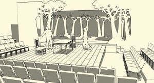
Below is an example of a design I did a few years ago for a production of “The Crucible”.  This image shows the plain SketchUp modeled design:

An image of my design for a production of "The Crucible" created in SketchUp

An image of my design for a production of “The Crucible” created in SketchUp

As you can see from this image, the set is a thrust stage with seating on all three sides.  The center thrust part of the stage is a simple rough-planked, raked stage with a few pieces of furniture.  Up stage is a row of cut-out trees that are silhouetted against a white backdrop that can be lit with different colored lights to change the mood and atmosphere.  Additional tree cut-outs act to provide wing space on stage left and right.

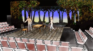
The image below is what the design looks like when color and other details are added in Piranesi:

The design for "The Crucible" created in SketchUp with details added in Piranesi

The design for “The Crucible” created in SketchUp with details added in Piranesi

First off, notice what a difference there is by simply adding color to a design presentation.  What I do want you to notice more, however, is that the design looks like it was created by hand and has a more “sketchy” quality to it.  This can give a more “artistic” more creative feel to your design and people may be more inclined to comment on it.

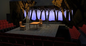
As one more example, here is the same design below, after it was rendered in a program called SUPodium:

A rendering of the design for "The Crucible" created in SketchUp and rendered in SUPodium

A rendering of the design for “The Crucible” created in SketchUp and rendered in SUPodium

Now, look at all three of the images.  Of the last two, people will like different ones. Some people will prefer the rendered image created in SUPodium because they feel it looks more “real”, while others will like the more “sketchy” look of the one created in Piranesi.  And that is my point.  Since people are different and have different tastes and visions in their head, you need to have different tools, and know how to use them, to be a successful designer.

SketchUp IMHO: SketchUp and Piranesi

Last week I talked about how there are many plug-ins for SketchUp that give the program more artistic range, meaning, with a small fee, you can add the new program to SketchUp and give yourself more tools to work with in creating your artistic vision.

I talked about Twilight last week, which gives you the opportunity to render your designs so that the results are photo realistic images.  These can often be more effective in communicating your design so that people can see almost exactly what the design will look like when completed.  I have even had situations where people have looked at my renderings and thought they were photos of an existing project and argued with each other on whether it was a photo or not.

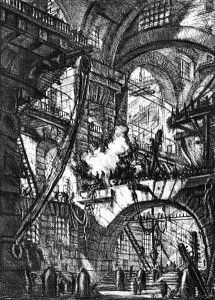
In this entry – I want to talk about a program that allows you to create images on the other side of the spectrum.  The program is called Piranesi and it is not a plug-in, but a stand alone program that allows you to export your SketchUp files into a format that works very easily in the program.  Piranesi (which is named after a famous Italian illustrator, known for his architectural drawings, one of which is shown below), allows you to take your design from SketchUp and very quickly add color and details that give it a more hand drawn, sketchy feel, looking exactly as if it had been colored with markers or colored pencil, or even watercolor.

Carceri Plate VI - The Smoking Fire - Piranesi

Carceri Plate VI – The Smoking Fire – Piranesi

You may wonder why this is necessary if you are able to create photo-realistic renderings which more accurately show how something will look.  Well, the answer is that people are different.  I know, shocking really and a bit inconvenient when it comes to creating a design for something that does not exist yet.

Some people need to see exactly what something will look like before they “sign off on it.”  There are times when the ability to show them that is very important to the design process.  Then there are times when you want to present a concept and invite comments and discussion.  This is where the more sketchy option comes into play.  Often people feel more comfortable commenting on something that has a more sketched feel.  It looks as if there is still room to make decisions and changes and therefor is more accessible to them.  That is an important step in the creative process and Piranesi is one more tool that makes creating those sketches easier.

Next week I will talk about how the program works and show examples…


SketchUp IMHO: SketchUp and Plug-ins

In the last post I talked about SketchUp and Layout and how those two programs in one work very well for creating 3D models and then the working drawings that are often necessary to build the object you have created.

This week I want to talk about one of the many plug-ins that work with SketchUp.  One complaint I have heard from some people about SketchUp is that it looks “too sketchy.”  I actually think that the ability to make the design look more hand drawn is a plus to me as I have found that some people just do not respond too well to the “cold” look of a computer generated design.  (In a later post I will talk about the “Style Builder” part of SketchUp.)

So, in response to those people who think SketchUp can only do “sketchy” there are programs that work within SketchUp and are often referred to as plug-ins.  One of my favorites is a program called Twilight.  No it is not the teenage angst/vampire love saga, but a program that allows you to place lighting throughout your model, adjust details on textures (which I will cover in a moment) and then render the image.  This results in a nearly photo realistic image.

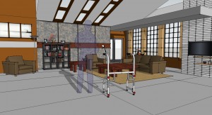
Here is an example of a set I designed for a TV commercial created in SketchUp:

The SketchUp model for the set design

The SketchUp model for the set design

As you can see by this image, the design is pretty straight forward.  It is meant to be an apartment for a single man that was built into an existing loft space.  There are large windows and a vaulted ceiling with skylights.  Most people would look at this and be able to see the space very easily.

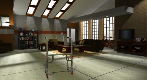
There are times, however, that you need to create a rendering that shows the space in a more realistic look.  This is where a program like Twilight comes into play.  By placing the lights where you want them to be, determining the color and focus of the lights and then when you render it, the result of this work is shown below:

The rendering of the set

The rendering of the set

As you can see, the way the light interacts with the models and the textures (yes, of course textures make a HUGE difference in how a model looks when it is rendered!), does make the image look much more realistic.

In later posts I will talk specifically about how Twilight works and how you can use it to create images like the one above.


SketchUp IMHO: SketchUp and Layout

In the past blog entries, I have talked about why I like SketchUp so much as a design tool.  One of the main reasons I like it and it works so well for me, is that the Pro version of SketchUp comes with a separate program called Layout.  The addition of this program is one of the things that makes SketchUp as a whole, so powerful.  SketchUp is a very intuitive program for quickly creating detailed 3D objects, and Layout allows you to use those objects and all the work you put into them, to quickly create your working drawings without having to recreate the objects.

In a nutshell, this is how it works.  You can create your 3D models in scale in SketchUp and create all the details and views on all sides and then import that model into Layout to create the working drawings.  In case you do not know, working drawings are the scale drawings that need to be created to allow a shop to build something accurately.

You can set up templates and pages in Layout and then bring in your objects and quickly and easily lay them out (get it…?) on the page, add dimensions and notes and thereby create a working drawing.  You can create as many pages as you need to communicate your design, even import photos for reference and added clarity, and then export them as PDFs for anyone to print and look at.

I mentioned above that Layout comes with the Pro version of SketchUp.  The Pro version sells for about $495 (which is terribly reasonable for what you can do with the program).  It does not come with the free version of SketchUp.

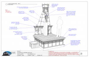
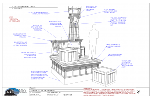
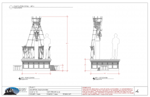
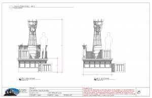
I have included a few pages below from a set of drawings that we created for a project a few years ago that was built in our shop.  The pages show how you can create scale elevations (front on views of the different sides of an object) quickly and easily once you have created the 3D model.

Select-pages-from-design-package_02Select-pages-from-design-package_03Select-pages-from-design-package_04Select-pages-from-design-package_05

SketchUp IMHO: Don’t Forget Those Tutorials

As I said in an earlier post, SketchUp is quite easy to use and with just a bit of effort, you will find that you are modeling very quickly and confidently. Aside from getting in there and using the program – the best way to learn what it can do (without formal training) is to watch the tutorial videos that SketchUp has created.

These videos can be found on the SketchUp website under “Training”. There are twenty-eight videos under the heading “New to SketchUp.” The videos are divided into four introductory videos to get you started with the basics, then twenty four videos, each of which focuses on a tool in the program. You can get quite a bit out of these and I would encourage you to watch all of them, even if you already think you know everything there is to know about a tool.

Next, there are 10 videos under the heading “Familiar with SketchUp”

that give you more in-depth information on setting up and using scenes, more accuracy in your modeling, making dynamic components (which are really cool!) and other techniques.

Finally, there are 4 more videos under the heading “Expert in SketchUp” which show you how to use SketchUp with other CAD programs, using SketchUp with Photoshop, modeling architectural elements more accurately and efficiently, and other techniques.

All in all, the videos are well made and informative and I think they are a valuable resource for learning SketchUp quickly and at your own time and pace.

Go on – give them a try…


Enhanced by Zemanta

SketchUp IMHO: Modeling With Your Clothes On…!

When you actually start using SketchUp, you will see that it is really quite easy to create complex models with ease.  There are really just a handful of tools – but they each do several things and are each both powerful and simple and easy to use.

One of my favorite tools is the “orbit” tool.  Once I have created something I often find myself spending a fair amount of time rotating around the object to get different views of it. In fact, one day I was in my third hour of modeling on something and one of my students walked into my office for the third time and said, “That’s funny – the last time I was in here, you were just rotating that picture around.  Is that all you do?”   I explained that there was more to it than that – but, in truth – he had caught me admiring my work.

This is both satisfying and useful. Every artist needs to stand back from their work and take a look at it, squint at it, and evaluate it.  This tool allows you to do that with ease.

More importantly than that though, is the fact that it keeps you connected with your work.  The freedom to quickly rotate the piece you are working on makes it feel as if it is right in your hands and you are free to manipulate it as you see fit.  This, to me, is one of the things that makes SketchUp such a creative program to use.  You are not separated from your work by too many palettes or commands that remind you that you are using a machine to create your work.

It doesn’t take long before you forget you are working with a computer program and are fully drawn into your creation.  That’s the really cool part.  You know you have been using the program a lot when you look at real-world objects and subconsciously think, “Orbit, Push-Pull, Move, Follow Me…”  (And yes – that actually happens to me…)

Ready to start your modeling career…?

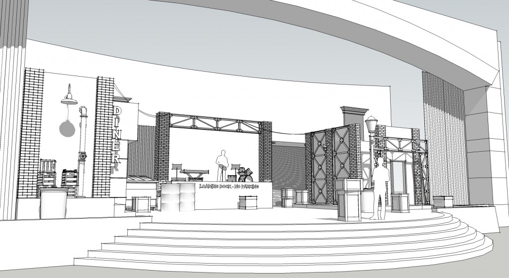
Heroes-Conference-design-REVISED-8-23-10-View-21


SketchUp IMHO: Why I Believe SketchUp is Great – Reason #2

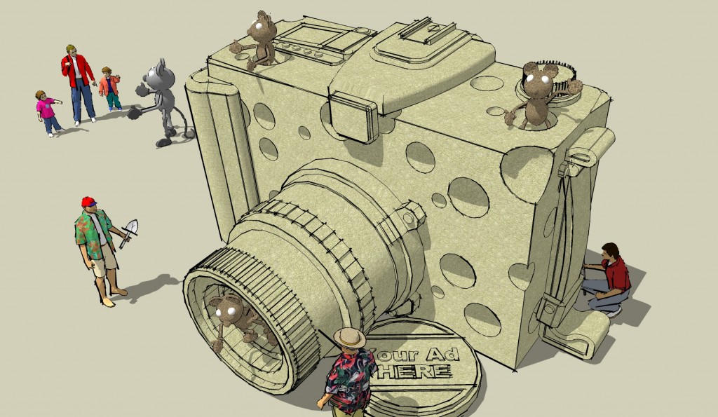
Cheese-camera-sketch-10-15-07So here it is – reason #2 why I think SketchUp is great.

It’s basically free.  That’s right – free.  You can download it and begin playing (er, I mean “creating”) with it.  (You can’t use the word “play” when describing a CAD program or no one will take you seriously – yet that is EXACTLY what it feels like…)

So – download the program and begin to “create” with it and see just what I am talking about.  The pro version (currently selling for about $500.00) has many more features and everything of course that makes it a great deal at that price.   The basic version of the program and your ability to create wonderful 3D models is still free and you can’t beat that.  No “Free trial run for 30 days”. No annoying watermarks on your work.  Just free.

And that, very simply, is reason #2.

So, go spend time (not money) on SkethUp and start creating…

Enhanced by Zemanta

SketchUp IMHO: Why I believe SketchUp is great – Reason #1

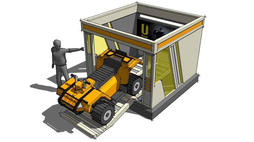
ATV-Vending-Machine-sketch-3-1-062Let’s start with this one.  There are many great design programs out there that are very good.  There is the “industry standard” for film and game development, 3D Studio Max or even Maya.  There is AutoCAD, the “industry standard” for architecture and also 3D design.  Then there are the rest of the programs which are too numerous to list in a blog like this, but suffice it to say that they all have advantages and disadvantages.

Then there is SketchUp.  Let me get one thing clear before I begin.  I do not have stock in SketchUp. I am not an employee or owner or tied in anyway to the company other than the fact that I have been a loyal customer for many years.

I began using the program back in 2004 when a designer friend of mine at Disney showed me the program.  My first impression was that it looked way too simple to be useful.  I played with it a bit and was not immediately impressed.  The hook was when I got a job as an art director on a video game and needed to use a 3D design program to work with the concepts (and try and get some credibility with the game artists who looked at my hand drawn designs with a bit of confusion as I mentioned pencils and paper…).  I had to dive into the program and learn it quickly.

And that was when I got hooked.

It was an incredibly intuitive program to use.  It’s apparent simplicity was really its strength.  In a nutshell – the program allows you to focus on designing, not focus on learning a program.  That is the key.

Since then I have used SketchUp nearly daily for almost eight years.  I have not formally counted all of the drawings I have created in those eight years, but conservatively, I have created well over 10,000 pages of drawings on over 400 designs for TV, film, theater, live entertainment, game design, and many other areas of design. (I will add a link at some point so you can see some of those images).

So, I know at this point you have no reason to believe me, but take my word for it and give the program a chance.

Next we will talk about other reasons why the program is great…


Enhanced by Zemanta