SketchUp IMHO: Textures, Textures Everywhere and Not a One to Use…

If you have been following my blog here on SketchUp (if so – thank you!) you will be aware of two things.  First – you will of course notice that it has been quite some time since I have posted something (more on that later), and second – I really, really like SketchUp.

Except for one thing…

The textures that come with the program.

Since this blog is a part of the two sites we currently manage, one for research images and one for textures, you may think that my criticism is a thinly-veiled comment that is really only self-serving.  While it is true that there is an obvious connection from this post to what we do – trust me – my issue with textures in SketchUp goes back years.  Long before our texture site was even a twinkle in my internet camera’s eye.

Don’t get me wrong – I think it is great that they provide a set of textures to get you started on modeling.  Actually, not many modeling programs provide textures with the program at all, so the fact that they do is a generous addition.  Adding textures to a model helps tremendously in the presentation of your work, and if you plan on rendering your model – then REALISTIC textures are a MUST!   Most of us who do modeling in SketchUp just go out and scour the internet for good textures, but wouldn’t it be more convenient to just be able to grab textures within the program, instead of having to go out and find them…?

The lack of a good selection of nice, high quality textures (in my humble opinion) is the one thing that is holding the program back even just slightly.

Hmmmm… wait a minute… I wonder if they would be interested in working out a deal…?  We could provide them a set of say, 500 hi-resolution architectural textures for free, in exchange for a little mention somewhere on their site… What do you think…?

I think I may have hit on something…

(Okay – admittedly – that last part was a not-so-thinly-veiled plug for our site.  I do, however, still strongly believe that the program would be better with a nice selection of good textures!)

RSWL: Crowdfunding

Crowd what…?  According to Wikipedia.org crowdfunding can be defined as: “Crowdfunding (alternately crowd financingequity crowdfundingcrowd-sourced fundraising) is the collective effort of individuals who network and pool their money, usually via the internet, to support efforts initiated by other people or organizations.”

So, why am I talking about this for this week’s entry to Random Stuff We Like…?  Well, it just so happens that we are working on a crowdfunding campaign where our goal is to raise money for additional help on the sites, and more importantly – raise money to use for marketing our sites.  There are several companies out there that will help you put your crowdfunding program together (for a fee of course) and we have chosen to go with a company called Fundable.com.  We have been working with them for about a month now, and within the next month – we will launch our campaign.

Here is how it works.  Fundable.com sets up an online profile for us that anyone who has access to the internet can look at and contribute to.  We set a goal for how much money we want to raise and explain who we are, why we deserve the money, and what we intend to do with the money.  In exchange for money from people, we offer rewards.  For instance, if you give us $25.00 we will give you a permanent listing on our site as a contributing member, a decal (for your car, Vespa, bike, go-cart or skateboard, motor home, etc.) a water bottle, and 5 credits to be used on the site to “purchase” images you like.  Just the credits alone are a $75.00 value!

The list for rewards, of course,  goes up the more you contribute.

If you have been following us for the last year or so, you will know that we have been hard at work building a unique, creative tool that we believe will have real impact on how artists are able to create and imagine.  We have received positive feedback from friends and family as well as professionals in many of the industries we intend to target with our marketing.  In short – we have built it – now they will come (with marketing, financial support, moral support and a lot more hard work of course…)

We are very excited about this campaign and will be telling you more about it in the next few weeks.  Please keep an eye out for our e-mails announcing the start of the campaign and we greatly appreciate any help you can provide!

Stay tuned…

Random Stuff We Like: Google Plus

Social media,  love it or hate it, it does not appear to be going anywhere.  I (reluctantly) added a Facebook page only a few months back, and that was only so that I could keep in contact with students of mine.  Facebook can be a fun way to see what your friends and family are doing and to let them know what you are up to without the annoying details of actually having to interact with them (that was sarcasm…).

Seriously, while I do see some advantages to being able to see what friends and family are up to and communicate with them even on some level, I still look at Facebook with a sort of reluctant acceptance.  Why does it keep suggesting thing that I should like?  Why are there all those ads…?

So, when a friend of mine was suggesting that we use Google Plus for a social media avenue to help market our company (tmgtextures.com), I was a bit skeptical about how much I would even want to use it.  If it meant getting our name out there, fine, then I guess I would partake.

Well, I can say that after using Google Plus for the last six months, I really like it.  For one thing there are no annoying ads that pop up.  For another – the  whole social structure is built around communities, which are, well… communities of people who share a similar interest such as basket weaving, Akitas, Russian nesting dolls, liposuction, textures, and… well, you get the idea.  A community can be about anything you want it to be about.  If you don’t see a community devoted to what you are interested in, it only takes minutes to set one up.

Since the basis of the interaction is centered on these communities, the people you interact with generally tend to be professionals or at the very least – people who share your passion for a particular subject.

So take my word for it and if you have not already – go set up a profile on Google Plus and then start looking around at all of the communities and join a few.  Check back here later and I am sure we will have some suggestions for a few you could join…


TMG Philosophy: Cause and Effect – Part One

This is a subject that I think is so important – I will write about it in several parts (fair warning)…

The concept I want to talk about is “cause and effect.”  The way my mind works (this may be a fairly scary area to go into), this has always been a pretty straight forward idea.  For instance, as a kid if I was told not to do something and I went ahead and did it anyway, I could expect that there would be an “effect” for what I did.  Make sense so far…?

Another idea I firmly believe, that is closely tied to the concept of cause and effect, is the idea that when you break it down, life is quite simply a series of choices.  We all have many, many choices to make in our lives.  Some are hard, some are easy.  Some may appear to be easy, but turn out to be more complex or difficult than we anticipated   In any event, we have choices to make and hopefully, at the end of our lives, we have made more good choices, than bad.

The thing that makes choices even more exciting is when that whole cause and effect thing comes into play.  Even choices that we believe are good, and the right thing to do, may have an unintended effect that could even be negative.

Again, does this make sense to you so far…?  If it does make sense to you, then let’s move onto the next idea.  If it doesn’t make sense… well, I guess you should stop reading because this is just the beginning of my thoughts on this (hence, the “Part One” on the title above).

Okay, since you have stuck with me, I guess I can assume you understand what I am proposing so far.  If we agree that there is definitely a cause and effect, and that life is in its most basic form – a series of choices… then why do people seem to be so stupid…?

Admittedly that last statement was a bit harsh, but really – why is it so hard to understand? For instance, we talk quite a bit about learning, exploring, and asking questions on this blog.  That is because those things are firmly rooted in who we are, and as such – help to make up our philosophy. The obvious effect of all of that is that you learn and see new things.  That, for the most part, is a good thing.  Right?

So, when you listen to people (or even listen to yourself) and there is this theme of “why am I stuck in this” –  (fill in the blank) or, “I am tired of this”  – (fill in the blank), and so on, doesn’t it make sense that the answer to whatever is that is irksome is to change it.  So now you have choices to make.  Is it really that bad? (Yes or no.)  Are there other options?   (Yes or no.)   Is it time to make a change?  (Yes or no.)  And of course that process goes on and on…

The “effect” in what I am talking about is your life.  And by and large, you are the “cause”, so take charge and make choices that will hopefully have the “effect” you are looking for.  Make sense so far…?

More to come…


TMG Philosophy: R-E-S-P-E-C-T…Find Out What That Means to Me…

So, just a heads-up, but this entry may be more of a rant than actual philosophy.  I feel a compulsion to talk about RESPECT as it has been on my mind even more lately.  So, here goes…

As an artist and creative individual, I believe in the “gray area”  – a lot.  What does that mean?  Well, I am not talking about gray area morally, I am talking about not seeing the world in such a linear and black and white way, so that point of view ultimately harms you.   Being black and white in your point of view leads to making assumptions about things, about people and keeps you from having an open mind, which is what you need in order to explore and be creative.

On some things, however, I am very black and white.  One of those is the idea that “fair is fair” and that you treat people with respect, because that is only fair.  As the owner of a business, I have hired many, many people over the years and as a result, I have also had to fire many, many people over the years.  (Now, one could make the point that I must not be good at hiring – but, that is not my point)  Firing someone is not easy.  There is clearly a lot of tension and even anger.  I can honestly say though that in all the times I had to fire someone, most of the time it ended with them shaking my hand and thanking me.  Seriously.  They would thank me.

Some would say it was for the opportunity to work there at the company and others would say it was for how I handled this firing process.  I soon came to realize that they were actually thanking me for treating them with respect.  They may have been very angry with me and even hated me, thinking I was ruining my own company by letting them go, but they always made some mention of respect and how I had treated them.

I believe everyone needs to be treated with respect, and I have found that I expect to be treated with respect (mainly because that is how I treat people).  As a result of this expectation, it is no wonder that I get very upset when I (or even worse – a loved one or friend) is not treated with respect.  That is when I become very black and white and see a definite cause and effect.  “They have crossed a line and now need to be punished to the full extent of the law” (whatever that means…!)  I have very little desire to try to “understand” why they did what they did – it’s just wrong.  Unacceptable. Period.  End of story.  They must be brought to see the light, to be shown just how amazingly and utterly wrong they actually are!

My wife is on the other side of the world, working a temporary contract in another culture where that idea of respect is, well, different from how I tend to see it.  They are not bad people (I am really trying here to be more “understanding”) but they just treat people differently.  So this week when they were so rude and disrespectful to her – it was really, really hard for me to not get on a plane and go over there and beat some respect into them.  Then, slowly, and begrudgingly I realized that that attitude was not the best attitude to have, and that I had to admit – I was not respecting them.

Don’t get me wrong here – I have not been fully enlightened.  I still feel a strong urge to beat some sense into them (very respectfully of course) but, I am realizing that it is a lot easier to respect someone who treats you with respect, than someone who does not.  I know – kind of a “duh” moment there – but like I said at the beginning of this – I tend to be a bit more “black and white” here and not as open minded so I am learning…


SketchUp IMHO: Piranesi Part 2

Last week I talked about the program Piranesi and gave a broad overview of how it works. This week I want to show a few examples so you can see what the difference is in how they look.

Just to recap – the main purpose of Piranesi is to give a design a more “sketchy” feel to it and that effect can help you when you are communicating your design.  Some people respond in a more positive way to a design that looks like it is created by hand, rather than one that is obviously created digitally.  Even though a vast majority of art is created in the computer in some way, many people still see that process as “cold”.

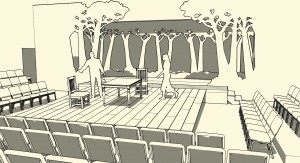
Below is an example of a design I did a few years ago for a production of “The Crucible”.  This image shows the plain SketchUp modeled design:

An image of my design for a production of "The Crucible" created in SketchUp

An image of my design for a production of “The Crucible” created in SketchUp

As you can see from this image, the set is a thrust stage with seating on all three sides.  The center thrust part of the stage is a simple rough-planked, raked stage with a few pieces of furniture.  Up stage is a row of cut-out trees that are silhouetted against a white backdrop that can be lit with different colored lights to change the mood and atmosphere.  Additional tree cut-outs act to provide wing space on stage left and right.

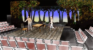
The image below is what the design looks like when color and other details are added in Piranesi:

The design for "The Crucible" created in SketchUp with details added in Piranesi

The design for “The Crucible” created in SketchUp with details added in Piranesi

First off, notice what a difference there is by simply adding color to a design presentation.  What I do want you to notice more, however, is that the design looks like it was created by hand and has a more “sketchy” quality to it.  This can give a more “artistic” more creative feel to your design and people may be more inclined to comment on it.

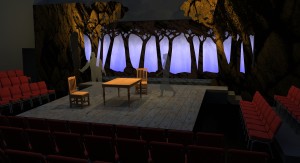
As one more example, here is the same design below, after it was rendered in a program called SUPodium:

A rendering of the design for "The Crucible" created in SketchUp and rendered in SUPodium

A rendering of the design for “The Crucible” created in SketchUp and rendered in SUPodium

Now, look at all three of the images.  Of the last two, people will like different ones. Some people will prefer the rendered image created in SUPodium because they feel it looks more “real”, while others will like the more “sketchy” look of the one created in Piranesi.  And that is my point.  Since people are different and have different tastes and visions in their head, you need to have different tools, and know how to use them, to be a successful designer.

Random Stuff We Like: Steam

I like to play games.  No, I am not talking about hopscotch, jump-rope, pin the tail on the donkey, and certainly not psychological games to mess with people.  I am talking about video games.  It has always been a hobby of mine for at least the last 30 years.  I remember back in 1982 when we bought the Atari 800 that had a full keyboard and a lid that you lifted up to plug in cartridges for games.  When we bought the 5.25″ disc drive for the computer (for around $800!) that was the height of technology and we could now buy all sorts of other games!

The process of buying games and downloading them has come a long way in 30 years.  Now there are many, many ways for you to purchase games if you enjoy them.  You can get games on your phone, on your i-pad, your gaming console, etc.  You can walk into a store and buy them or, even better – you can download them.

And that is where Steam comes into play (no pun intended).  Steam started out to be copy protection for a very popular game created by a company named Valve (get it – Valve…Steam…?)   Very soon after release, they offered the ability to digitally download games.  At first it was just their own games, and then after a short while they offered many games from other game makers.

They are now the largest and most popular digital download platform with an estimated 70% of a 4 billion dollar a year digital download business worldwide.  As of the writing of this blog entry I could not find an exact total of games that they offer, but on the front page of their site they say they have 2,569 games under $10.00 and 1,576 games under $5.00.  Just those numbers alone show that they have a lot to choose from.

They offer the most current games from big game developers as well as small “indie” games that are made by one or two people.  In my opinion, they are very democratic about what games they offer on their site.

They also routinely have huge sales on top games.  During Christmas and New Years for instance, they often had top selling games for anywhere from 50% to 75% off.  That is a big discount!

Not into games…?  Well, they just recently added a section for software where they offer a variety of programs that range from personal budget programs to game development software.  Just last month Amanda wrote a recommendation for Camera Bag 2 and mentioned that it is offered on Steam.

You should check it out and see what they offer.  Everyone enjoys a good game now and then.  I know there was a time a few years back when my whole family was practically addicted to a game called Bookworm, and I have to say without a doubt … it was time well wasted!

SketchUp IMHO: SketchUp and Piranesi

Last week I talked about how there are many plug-ins for SketchUp that give the program more artistic range, meaning, with a small fee, you can add the new program to SketchUp and give yourself more tools to work with in creating your artistic vision.

I talked about Twilight last week, which gives you the opportunity to render your designs so that the results are photo realistic images.  These can often be more effective in communicating your design so that people can see almost exactly what the design will look like when completed.  I have even had situations where people have looked at my renderings and thought they were photos of an existing project and argued with each other on whether it was a photo or not.

In this entry – I want to talk about a program that allows you to create images on the other side of the spectrum.  The program is called Piranesi and it is not a plug-in, but a stand alone program that allows you to export your SketchUp files into a format that works very easily in the program.  Piranesi (which is named after a famous Italian illustrator, known for his architectural drawings, one of which is shown below), allows you to take your design from SketchUp and very quickly add color and details that give it a more hand drawn, sketchy feel, looking exactly as if it had been colored with markers or colored pencil, or even watercolor.

Carceri Plate VI - The Smoking Fire - Piranesi

Carceri Plate VI – The Smoking Fire – Piranesi

You may wonder why this is necessary if you are able to create photo-realistic renderings which more accurately show how something will look.  Well, the answer is that people are different.  I know, shocking really and a bit inconvenient when it comes to creating a design for something that does not exist yet.

Some people need to see exactly what something will look like before they “sign off on it.”  There are times when the ability to show them that is very important to the design process.  Then there are times when you want to present a concept and invite comments and discussion.  This is where the more sketchy option comes into play.  Often people feel more comfortable commenting on something that has a more sketched feel.  It looks as if there is still room to make decisions and changes and therefor is more accessible to them.  That is an important step in the creative process and Piranesi is one more tool that makes creating those sketches easier.

Next week I will talk about how the program works and show examples…


TMG Philosophy: “Do Not Feed the Alligators!”

So, this morning I am sitting in a hotel lobby in Orlando, Florida, writing this blog entry, eating my breakfast muffin sandwich (which was way too expensive by the way) and waiting to go out and get some shots (photos, not tequila!).

The other day I was out walking around the grounds of the hotel, exploring and trying to find some interesting shots when I kept running into small ponds and streams blocking my way.  There were things on the other side of these barriers that I wanted to get to, but I kept getting blocked at each turn.  The water in these ponds was an odd greenish brown color with things floating on, and just under the surface.  The water was pretty murky and it was hard to tell if it was a foot deep or 10 feet deep.

I really didn’t want to get my feet wet, and not knowing the depth of the water or what was in it, I just decided to see if there was another way around.  For a good part of two hours, I wandered through the paths and tried to find a way out of the grounds of the hotel, but was always blocked by these “water hazards”.

In a few cases I came across a sign that made it even clearer that I should not venture into the murky water.  It read:  “DANGER Do Not Feed Alligators”.

A sign in Orlando, warning you not to feed the alligators, which, when you think about it, doesn't NOT feeding them only make them hungrier and more desperate...?

A sign in Orlando, warning you not to feed the alligators, which, when you think about it, doesn’t NOT feeding them only make them hungrier and more desperate…?

Some of you may now see how this blog entry ties in to my last blog entry about “fear”.  Some would say that there is a good type of fear that keeps us from doing things that could be harmful to us.  I do believe this is true and in this case, I am not sure that it was actual fear of alligators that was keeping me from entering the water (my heart rate wasn’t increased, my palms were not sweaty, etc.) but more the fear of the unknown:   Were there even alligators in there?  If so, how many?  How big were they?  Had they just eaten a deer, someone’s pet or a small child so they were now lethargic and napping on a full stomach?  Had they moved to a better neighborhood, possibly one with better schools, closer to work…?  My mind calculated all of this, and many more options and I finally decided that since I did not know enough, it would be better to avoid that water.

And that is my point.  Some barriers are in fact there to keep us safe.  And some are there to protect us from the unknown.   But I firmly believe that it is our responsibility as individuals to study those barriers, ask questions, and generally just learn more about why we are being told we cannot do something.  Then we need to decide if we want to question and test them or not.  Sometimes the barriers need to be broken and sometimes they do not.  It is not black and white.  In short, we are meant to explore, and exploration is risky.

Now that I have finished my muffin sandwich and iced-tea, it is time to get out there and explore…

You should too (just watch out for the alligators)…!

SketchUp IMHO: SketchUp and Plug-ins

In the last post I talked about SketchUp and Layout and how those two programs in one work very well for creating 3D models and then the working drawings that are often necessary to build the object you have created.

This week I want to talk about one of the many plug-ins that work with SketchUp.  One complaint I have heard from some people about SketchUp is that it looks “too sketchy.”  I actually think that the ability to make the design look more hand drawn is a plus to me as I have found that some people just do not respond too well to the “cold” look of a computer generated design.  (In a later post I will talk about the “Style Builder” part of SketchUp.)

So, in response to those people who think SketchUp can only do “sketchy” there are programs that work within SketchUp and are often referred to as plug-ins.  One of my favorites is a program called Twilight.  No it is not the teenage angst/vampire love saga, but a program that allows you to place lighting throughout your model, adjust details on textures (which I will cover in a moment) and then render the image.  This results in a nearly photo realistic image.

Here is an example of a set I designed for a TV commercial created in SketchUp:

The SketchUp model for the set design

The SketchUp model for the set design

As you can see by this image, the design is pretty straight forward.  It is meant to be an apartment for a single man that was built into an existing loft space.  There are large windows and a vaulted ceiling with skylights.  Most people would look at this and be able to see the space very easily.

There are times, however, that you need to create a rendering that shows the space in a more realistic look.  This is where a program like Twilight comes into play.  By placing the lights where you want them to be, determining the color and focus of the lights and then when you render it, the result of this work is shown below:

The rendering of the set

The rendering of the set

As you can see, the way the light interacts with the models and the textures (yes, of course textures make a HUGE difference in how a model looks when it is rendered!), does make the image look much more realistic.

In later posts I will talk specifically about how Twilight works and how you can use it to create images like the one above.