
Last week I talked about the program Piranesi and gave a broad overview of how it works. This week I want to show a few examples so you can see what the difference is in how they look.
Just to recap – the main purpose of Piranesi is to give a design a more “sketchy” feel to it and that effect can help you when you are communicating your design. Some people respond in a more positive way to a design that looks like it is created by hand, rather than one that is obviously created digitally. Even though a vast majority of art is created in the computer in some way, many people still see that process as “cold”.
Below is an example of a design I did a few years ago for a production of “The Crucible”. This image shows the plain SketchUp modeled design:
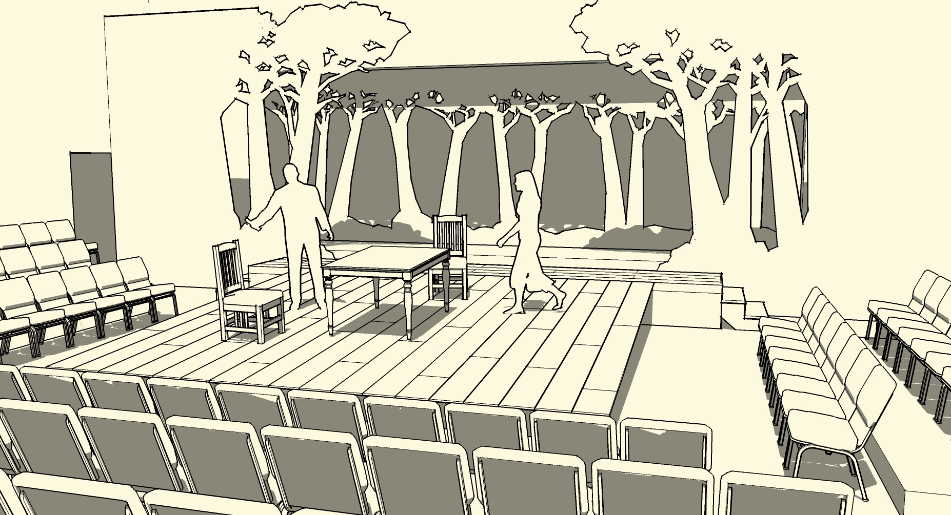
An image of my design for a production of “The Crucible” created in SketchUp
As you can see from this image, the set is a thrust stage with seating on all three sides. The center thrust part of the stage is a simple rough-planked, raked stage with a few pieces of furniture. Up stage is a row of cut-out trees that are silhouetted against a white backdrop that can be lit with different colored lights to change the mood and atmosphere. Additional tree cut-outs act to provide wing space on stage left and right.
The image below is what the design looks like when color and other details are added in Piranesi:
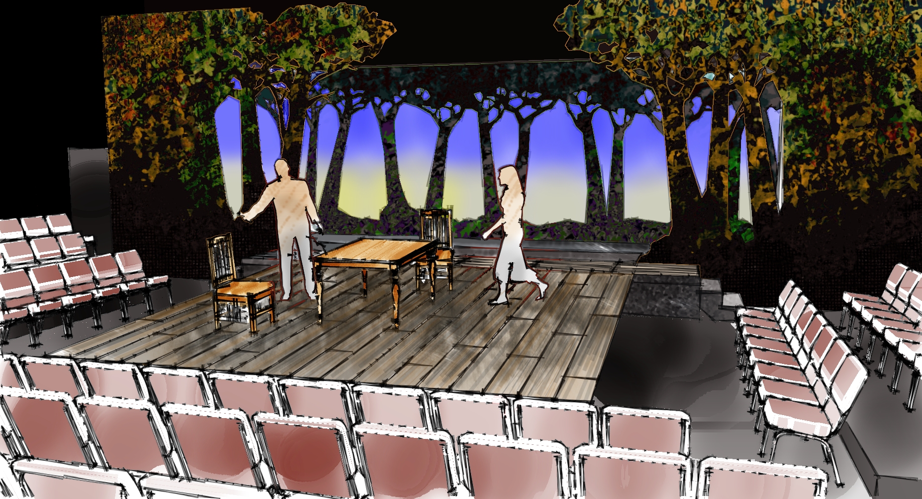
The design for “The Crucible” created in SketchUp with details added in Piranesi
First off, notice what a difference there is by simply adding color to a design presentation. What I do want you to notice more, however, is that the design looks like it was created by hand and has a more “sketchy” quality to it. This can give a more “artistic” more creative feel to your design and people may be more inclined to comment on it.
As one more example, here is the same design below, after it was rendered in a program called SUPodium:
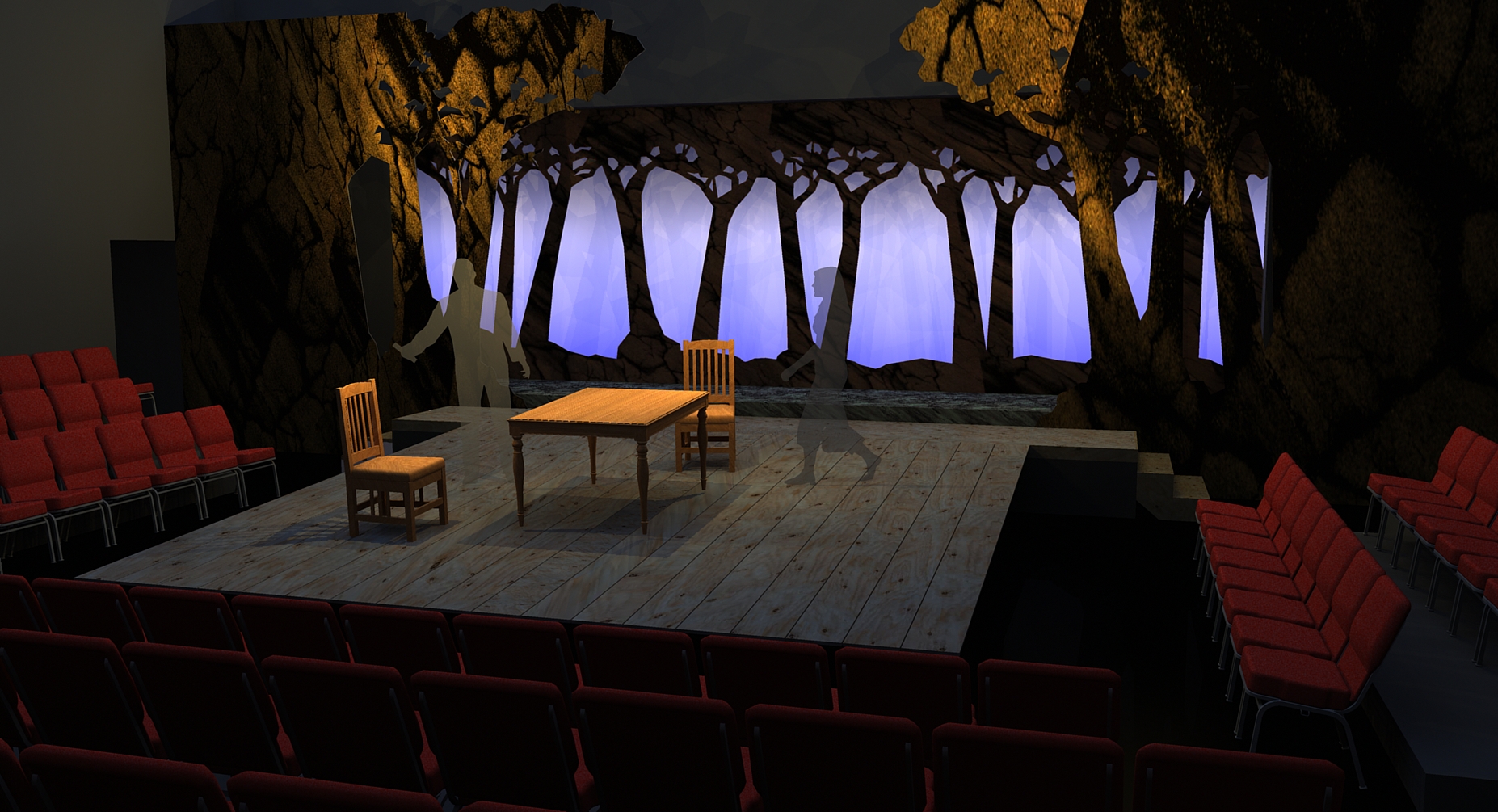
A rendering of the design for “The Crucible” created in SketchUp and rendered in SUPodium
Now, look at all three of the images. Of the last two, people will like different ones. Some people will prefer the rendered image created in SUPodium because they feel it looks more “real”, while others will like the more “sketchy” look of the one created in Piranesi. And that is my point. Since people are different and have different tastes and visions in their head, you need to have different tools, and know how to use them, to be a successful designer.
Tim, as you know I am not a designer, but reading your descriptions of SketchUp and the plugins has been very interesting to me. The difference between the last two renderings is greater than I would have guessed had I not seen them. I am sure that everyone who views them will have a favorite. Your wisdom, and experience, have forestalled a raging argument about which is “best.” The one that is best is the one that “best” communicates the design to the viewer, and that can be either one depending on the viewer.
Pingback: A preview of a design assignment I’m working on | interiorsinjapan